
Push Button
Purpose
A push button initiates an action when the user clicks it.
Buttons have the benefit of affordance, i.e. their visual properties (they look like they can be pushed) suggest how they are used.
Guidelines
Is this the right control?
Buttons are available in several flavors:
Command Button
Use a command button to initiate an immediate action.
Don’t use a command button for navigation to another page (prefer a link in this case).
Don’t use a command button embedded in a body of text.
Don’t use command buttons for a group of actions. Consider using radio buttons with one ‘Apply’ option or a menu button.
Menu Button
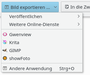
Use a menu button when you need to execute one action out of a small set of related functions.
Indicate the menu by a single downward-pointing triangle.
Clicking the button will drop down the menu only.
Don’t use the delayed menu button pattern.
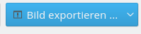
Split Button
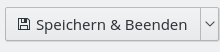
Apply a split button when one of the commands is used by default.
Clicking the left part (or right in case of RTL alignment) of a split button starts the default action; clicking the split area opens the menu.
Change the default item to the last action when the user is likely to repeat the command.
Behavior
Buttons are not dynamic: their icon and label should not change depending on the context (except special split buttons).
Don’t initiate an action on right-click or double-click.
Provide feedback when user is not aware to results or when results are not available instantaneous. Display a busy pointer or present a progress bar to users (see progress indicator).
Denote the relationship between buttons with other controls by placing them logically together.
Don’t use the delayed (menu) button pattern.
Appearance
Indicate a command that needs additional information (including confirmation) by adding an ellipsis at the end of the button label.
Buttons have an elevated appearance; don’t make buttons flat (except in toolbars).
Don’t use icons for confirmation buttons like OK, Apply, or Cancel.
Passive actions like those in the “System Settings => Application Appearance => Fonts” don’t have icons (does not apply to toolbar buttons that always have an icon).
If icons are applied (or not), this style should be used consistently for a group of buttons.
For buttons with text labels, use a minimum button width of 96px and the standard button height. Don’t use narrow, short, or tall buttons with text labels.
If the same button appears in more than one window, use the same label and access key. Locate them in approximately the same place in each window.
Use title style capitalization for the label.
Use a verb or verb phrase for the title of a push button.