
Icon Design
Purpose
Icons are pictorial representations of functions and objects. They convey meaning that users perceive almost instantaneously and are an important part of a program’s visual identity.
Well-designed icons strongly impact users’ overall impression of the design. Consistent use of icons also improves usability by making programs, objects, and actions easier to identify and learn.
Note
See the workflow tips on how to create an icon if you are interested in designing icons for your application. Or you can ask the KDE Visual Design Group for help.
General Guidelines
Use icons from the system icon theme whenever possible. Avoid using custom icons. New icons should be added to an icon theme.
Design icons with a small number of metaphors that are understandable independent of language and culture. Apply metaphors only once (e.g. don’t use a brush twice for different actions).
Simplify, but don’t go overboard.
Avoid using text in icon designs; it cannot be localized and tends to look bad at small sizes.
Many icons come in multiple sizes. Each version should be visually optimized and pixel-perfect for its particular size. Larger sizes offer more opportunity for detail and visual pizazz, while smaller version should be stripped of everything not absolutely necessary.
Monochrome icon style

Monochrome icons come in two sizes: 16px and 22px. 16px monochrome icons are commonly seen in menu items, tabs, and push buttons that have a raised, buttonlike appearance. 22px monochrome icons are used in ToolButtons. Monochrome icons at both sizes are used to represent small file types and entries in the Places panel in Dolphin and file dialogs.
Don’t use the monochrome style for larger icon sizes.
The Monochrome style is used for Action, Status, small Places, and small MIME type icons.
Colors
The monochrome style relies on distinct shapes and outlines instead of fine details and vibrant colors, and employs an intentionally limited color palette:
Shade Black (
#232629): Used for icons in a normal state and non-destructive actions: back, forward, ok, home, etc.This is the most commonly used color. When in doubt, choose Shade Black.
Icon Red (
#da4453): Used for icons that depict negative or destructive actions: “delete,” “remove,” “stop,” etc.
Beware Orange (
#f67400): Used for icons that involve warnings and user input of some kind.
Plasma Blue (
#3daee9): Used for icons that involve the action “select” or “insert”.
Noble Fir (
#27ae60): Used for icons that involve positive or successful actions: “connected”, “secure”, etc.
Margins and alignment
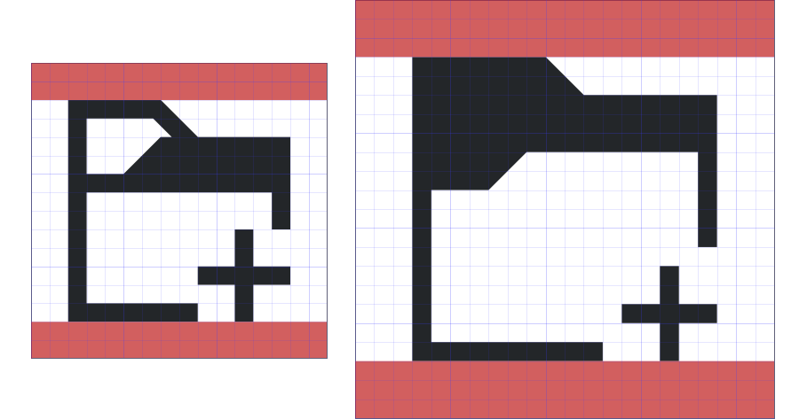
16px monochrome icons should not use the top or bottom 2 pixels, and 22px monochrome icons should not use the top or bottom 3 pixels:
Margins for 16px and 22px monochrome icons
It is recommended to keep monochrome icons perfectly square. For some types of icons described later (e.g. Places icons) this is a hard requirement.
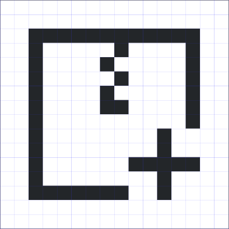
Because monochrome icons are so small and simple, it is important that they be pixel-perfect, with their lines and objects aligned to a regular grid:
Pixel-perfect icon: On the canvas and in the app
Adding Emblems to monochrome icons
Because monochrome icons usually depict actions, many include status or action emblems. These are always located in the bottom-right corner. The emblem should be a minimum of 5px wide and tall, and there must be 1px of blank space between the emblem and the rest of the icon.
A perfect monochrome icon with an emblem in the corner
Colorful icon style
Colorful Breeze icons make full use the Breeze color palette. They are not “flat” and incorporate shadows and smooth linear gradients going from darker on the bottom to lighter on top. Don’t be afraid to add detail, vibrancy, and depth!
This style of icon comes in three sizes:
32px: Category, Preferences, MIME type, and Places icons
48px: Application icons
64px: MIME type, Places, Devices, and a few Status icons
At all sizes, colorful Breeze icons generally consist of three parts:
First part: background
The background is a container and gives structure to the icon. It can have any shape or color in the Breeze color palette. Don’t be afraid to get creative with the background shape!
Colorful icons with a variety of creative background shapes
Second part: foreground symbol
The foreground symbol offers contrast with its background and works with it to provide the bulk of the icon’s meaning. The foreground symbol is optional; feel free to omit it if the background provides enough meaning on its own.
Third part: shadows
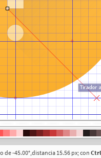
If present, the foreground symbol casts a long shadow angled 45° towards the bottom-right corner. This shadow always has the same gradient and takes up the whole object.
In addition, colorful icons have a 1 px hard shadow on the bottom: