
Device Types
In today’s world, there are many types of digital devices: desktop and laptop computers, smartphones, tablets, and so on. A harmonious and efficient user experience is only possible when the software’s user interface is tailored to each device’s physical characteristics and the way that a user will interact with it.
For information regarding the differences between a user interface and the user experience, see the Glossary.
Some devices are adaptable, e.g. a tablet with a keyboard plugged in, or a convertible laptop with only the touchscreen in use. These types of devices will require the user interface to adapt as necessary for each usage mode. If minimal changes are needed (for example, a laptop plugged into a large external screen) this can be achieved with a “responsive” design, as described in Responsiveness. For more extensive changes (for example, a tablet plugged into a docking station with a mouse and keyboard attached), an entirely different user interface paradigm may need to be presented.
Desktop/Laptop
Characteristics
Primary Input method: Keyboard and Pointing device
Input device precision: Very high: individual keys and screen pixels can be targeted and pressed with high accuracy
Screen size: Typically 28 - 76cm measured diagonally
Screen orientation: Fixed landscape orientation
Learning curve: Medium: keyboard and mouse skills must be learned
Optimal user experience
Since there is sufficient space, all components are directly accessible and multiple applications can be shown at once. The use of a keyboard allows quick and efficient text input without any on-screen elements. Pointing devices are highly accurate and user interface elements may be compact.
Though mouse-over (or “hover”) effects are possible, using them to hide functionality is discouraged, as it impedes usability and makes convergence more difficult. Hover effects should only be used for non-essential informational purposes, such as displaying tooltips.
It is possible to extensively customize the user interface to match the user’s workflow and aesthetic preferences.
Laptops should be properly supported, keeping in mind the following guidelines:
When using a touchpad’s two-finger scroll gesture, ensure that scrollviews do pixel-by-pixel scrolling instead of “jumping” certain number of rows.
Minimize window chrome and make sure that there’s enough space for content; avoid excessive toolbars and frames. Not everything needs to be visible all at the same time!
Minimize the use of Function keys as shortcuts, as these can be difficult to access with a laptop keyboard. Provide alternative accelerators wherever possible.
Don’t require right-clicking or middle-clicking for core functionality, as these can be difficult or impossible to simulate with a touchpad. In particular, never require the use of a right-click-drag or middle-click-drag.
Example
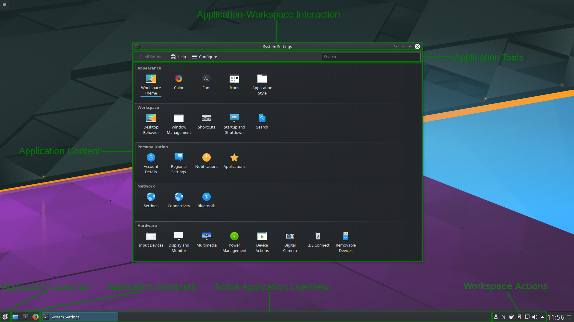
This describes the existing Plasma Desktop:
Workspace: Has Virtual Desktops
Application Launcher: Kickoff Menu in the Panel
Application Shortcuts: Applications can be dragged to the Panel or pinned in the Active Application Overview
Active Application Overview: Task Manager in the Panel
Workspace Tools: System Tray in the Panel
Application-Workspace Interaction: Titlebars and other window decoration for each application’s window
Application: Is windowed
Application Tools: Shows application-global tools at the top of the application window in the form of toolbars and menubars
Application Content: Most applications are already optimized for this device type
Tablet
Characteristics
Primary Input method: One or more fingers per hand touching a touchscreen, often with both hands
Input device precision: Low: wide variability of hand and fingertip sizes across user ages, sizes and genders. Sloppy input must often be corrected
Screen size: Typically: 18 - 30cm measured diagonally
Screen orientation: Dynamically switches between landscape and portrait
Learning curve: Low: intuitive touch input and simple apps
Optimal user experience
The characteristics of the touch input method dominate the design. User interface elements must be large enough to be accurately tapped by even the largest fingers. Sloppy input should be corrected by intelligent software, especially for textual input.
The main focus is the Application Content. Because of limited screen space, the workspace hides as much as possible. Applications should only show contextually appropriate content and tools, making the greatest possible use of the small screen space. Application windows should be opened maximized, with side-by-side or quarter tiling possible for larger tablets.
Example
Though the Plasma Tablet workspace does not yet exist, this example shows how it might behave:
Workspace: Has multiple home screens, similar to Virtual Desktops
Application Launcher: A launcher accessible from the home screen (not necessarily fullscreen)
Application Shortcuts: Live on the bottom Panel, similar to on Plasma Desktop
Active Application Overview: A fullscreen application switcher accessible from the bottom panel or auto-hidden controls (like a button bar containing the Home, Back and application switcher buttons)
Workspace Actions: A minimal top panel that auto-hides
Application-Workspace Interaction: Available from the Active Application Overview, and allows closing and re-arranging/re-ordering apps
Application: Runs fullscreen or tiled
Application Tools: Available from a toolbar within the application window. No desktop-style menubars are used. Commonly-used tools can be accessed through touch gesture shortcuts
Application Content: Needs to conform to the KDE HIG in order to display content in a way that’s suitable for this device type
Smartphone
Characteristics
Primary Input method: One or more fingers touching a touchscreen, usually with only one hand
Input device precision: Low: wide variability of hand and fingertip sizes across user ages, sizes and genders. Sloppy input must often be corrected
Screen size: Typically: 11 - 18cm measured diagonally
Screen orientation: Dynamically switches between landscape and portrait, though mostly used in portrait mode
Learning curve: Low: intuitive touch input and simple apps
Optimal user experience
Like with the tablet device type, user interface elements must be large enough to accommodate a large low-precision fingertip. Because of the even more constrained screen size, only a few interactive controls can be presented at one time. Others must be hidden on other pages or behind drawers and pop-up views.
Like the tablet mode, the workspace hides as much as possible and the main focus is the Application Content–only even more so. Great care must be taken to optimize the Application Content to the small screen size, omitting anything not absolutely necessary
While this device type is optimized for one-handed use, it may sometimes be useful to support two-handed use, especially when typing.
Example
This example shows how the Smartphone UX can be applied in the Plasma Mobile workspace:
Workspace: Has multiple home screens (similar to Virtual Desktops)
Application Launcher: A fullscreen launcher accessible from the home screen
Application Shortcuts: The bottom panel on the home screen
Active Application Overview: A fullscreen application switcher accessible from the bottom panel or auto-hidden controls (like a button bar containing the Home, Back and application switcher buttons)
Workspace Actions: A minimal top panel that auto-hides
Application-Workspace Interaction: Available from the Active Application Overview, and allows closing and re-arranging/re-ordering apps
Application: Always runs fullscreen
Application Tools: The absolute minimum possible assortment of tools are available from a toolbar within the application window. No desktop-style menubars are used. Commonly-used tools can be accessed through touch gesture shortcuts
Application Content: Needs to conform to the KDE HIG in order to display content in a way that’s suitable for this device type