
Metrics and Placement
Purpose
All controls should be sized and positioned to establish a harmonic overall picture and direct users’ attention. For instance, a list that captures most of screen’s space points to its central role in the current workflow. And, size can be used to indicate possible interactions. For instance, most smaller text fields are constrained in what data they can take.
Similar to size, the space between controls generates a visual impression and supports layout. Space between controls indicates their relatedness. Objects with smaller distances are mentally associated according to Gestalt psychology. Whitespace is an important element of design which enables the objects in it to exist at all. The balance between content and whitespace is key to grouping.
Please read Units and Measurements for more information which and how different units such as px, dpi independent pixels, smallSpacing and largeSpacing are used.
Guidelines
Size
If the control appears in a dialog or utility window, consider making the window and the control within it resizeable so that the user can choose how many items are visible at a time without scrolling. Each time the user opens this dialog, set its dimensions to those that the user last resized it to.
KDE seeks to support XGA (1024x768px) or WXGA (1280x768px) at least.
Keep in mind that not everyone is provided with a high resolution display.
Avoid to have a large number of controls visible at once, which in turn requires a huge minimal size.
Keep in mind that the available screen area typically also will be shrunk by panels and the window titlebar. Also, the user’s font might be bigger than yours (e.g. for accessibility reason).
You therefore should ideally preserve ~10% to catch those variables and try to not exceed 920x690px.
Minimum Control Sizes
Control |
Size |
|---|---|
Icons |
16 × 16px |
Buttons |
72 × 32px |
Line edits, drop-downs, combo boxes |
≥80 × 32px |
Text edits (text should not exceed 80 characters per line) |
≥80 × ≥36px |
Checkboxes, radio buttons including label |
≥80 × 24px |
Group boxes |
≥120 × ≥96px |
Tree views |
≥120 × ≥96px |
List views |
≥80px (per column) × ≥96 |
Space
Qt Widgets
If you are using Qt widgets you should use one of Qt’s layout classes, which will take care of laying out and spacing of your controls.
QML
For consistency you should try to use Kirigami and Plasma’s
smallSpacing and largeSpacing for margins and paddings whenever possible.
See Units and Measurements for more details.
When more spacing is required, use multiples of smallSpacing or largeSpacing.
Use of base units
Recommended Minimum Paddings
A
smallSpacingpadding is the minimum recommended padding inside elements (buttons, drop boxes, text fields, etc.)A
2 * smallSpacingpadding is the minimum recommended padding inside grouping frames (group boxes, tabs, etc.)
Default Minimum Paddings
Item |
Spacing |
|---|---|
Related items within groups |
|
Labels and items |
|
Related controls with same type (checkboxes / radio buttons) |
|
Related controls with different type (checkbox / button) |
|
Unrelated controls |
≥ |
Sample spacing
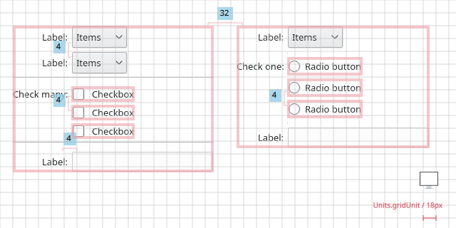
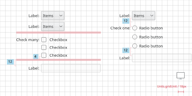
In some cases it may be useful to visually separate groups of related options within one group to facilitate scanning of the dialog. In that case, put a vertical, fixed-size spacer of 18px height between the options.
Separating groups of related options with a vertical spacer.
Hint
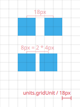
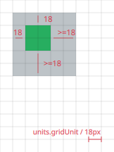
 It often helps to use a soft grid of 18px (gridUnit), when creating
mockups. But only use this as a visual hint, since plasma components and icon
size are not multiples of the gridUnit, so you will not be able to align everything to the
grid.
It often helps to use a soft grid of 18px (gridUnit), when creating
mockups. But only use this as a visual hint, since plasma components and icon
size are not multiples of the gridUnit, so you will not be able to align everything to the
grid.
Resizing
Provide resizing for all primary and mode-less windows.
If form resizing is not provided disable border icons and adjust form style.
Define a minimum size for resizable forms.
Make the content area scrollable if size is too small for all controls; don’t scale controls.
Do.
Add hints on how to resize to your mockups.