
Units and Measurements
Purpose
This pages gives an overview about different units used in Plasma and applications using KDE frameworks.
Pixel
A physical pixel or dot is a physical point in a raster image. It is the smallest permissible size for anything displayed by the device.
Caution
Be careful not to confuse physical pixels with DPI independent pixels.
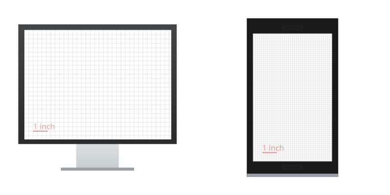
DPI - Pixels per Inch
Pixel density is the number of physical pixels or dots that fit into one square inch on the screen. Different screens have different DPIs. Screen density = screen width (or height) in pixels / screen width (or height) in inches.
Different DPIs on desktop and mobile.
DPI is often used interchangeably with PPI, pixels per inch.
Hint
 Don’t confuse this with the DPI setting in Photoshop, Krita, etc. For mockups you can just ignore this setting.
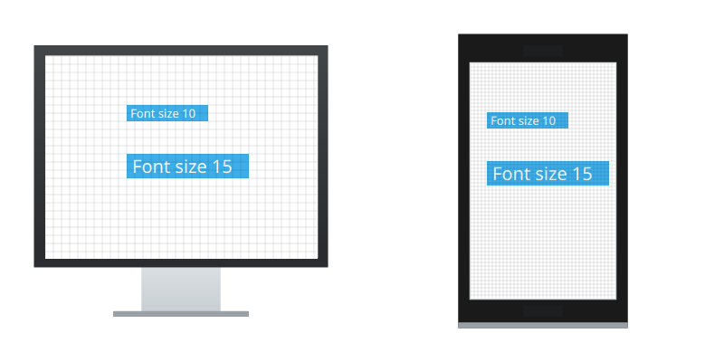
PPI / DPI Independent Pixels
A DPI independet pixel is scaled to look uniform on any screen regardless of its DPI. A lot of platforms, eg iOS, Android, the web, replaced the old physical px with a DPI px. So most of the time you read about pixel/px they’re most likely talking about DPI independent pixels. Qt (and QML) support DPI independent pixels in newer versions, but because KDE and software supports older versions of Qt as well, one can not assume that pixels used in Qt or QML apps are DPI independent.
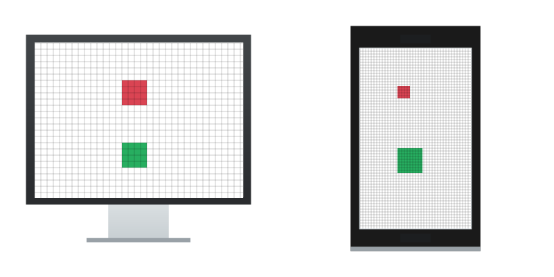
Different DPIs on desktop and mobile
A rectangle defined with physical pixels and DPI independent pixels.
Hint
 Unless explicitly stated otherwise, all HIG pages, draft, mockups, etc. use DPI independent pixels/px.
DPI Independent Pixels in KDE
As a developer, if you want to use DPI independent pixels in Plasma
use units.devicePixelRatio or Units.devicePixelRatio in Kirigami.
Caution
The use of devicePixelRatio should be avoided, but if you must, check the documentation and ask for more information in Plasma or Kirigami channel.
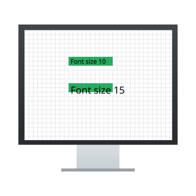
Base Units in Plasma and Kirigami
There are two types of DPI independent base units in Kirigami:
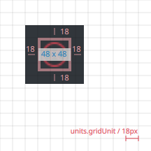
Units.gridUnitis the height needed to display one line of text. Use this for defining height and width of an element.Units.smallSpacingandUnits.largeSpacingare used to define paddings and margins.
These base units are not only DPI independent, but scale according to the font
settings too.
While designing, be careful not to rely on the ratio
between Units.gridUnit and Units.smallSpacing/Units.largeSpacing because these change depending on the user’s font settings.
A rectangle defined with Units.gridUnit.
Attention
These px values are only for design and mockup purposes. Don’t use them for development.
These are the base units in Kirigami:
Units |
Value |
|---|---|
|
4px |
|
8px |
|
18px |
And in Plasma:
Units |
Value |
|---|---|
|
4px |
|
18px |
|
18px |
Icon sizes in Plasma and Kirigami
There are several predefined icon sizes in Plasma and Kirigami. You should always use these icon sizes.
Attention
These px values are only for design and mockup purposes. Don’t use them for development.
Kirigami:
Units |
Value |
|---|---|
|
16px |
|
22px |
|
32px |
|
48px |
|
64px |
|
128px |
Plasma:
Units |
Value |
|---|---|
|
8px |
|
16px |
|
22px |
|
32px |
|
48px |
|
64px |
|
128px |
From Design to Code
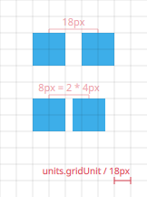
For any mockup, help the developers by specifying all measurements, either in the mockup itself or in an extra guide to the mockup. It is a lot of work and it is error prone for developers trying to measure everything from a mockup. Even if the mockup is in a file format that would allow exact measurements, don’t expect the developer to know how to measure it.
You don’t have to provide measurement for objects that can be easily calculated. For example the size of the dark rectangle in the above example can be easily obtained.
Recomended Spacings
When you design, try to use the recomended values for margin and paddings, to ensure a uniform appearance. See Metrics and Placement for more details.
Use of base units
1 2 3 4 5 6 7 8 9 | Row {
spacing: Units.largeSpacing
Rectangle {
...
}
Rectangle {
...
}
}
|
1 2 3 4 5 6 7 8 9 | Row {
spacing: 2 * Units.smallSpacing
Rectangle {
...
}
Rectangle {
...
}
}
|
Ratio
Sometimes the ratio between dimensions is more important then the actually values.
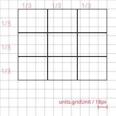
1 2 3 4 5 6 7 8 9 10 11 12 13 | Grid {
columns: 3
...
Repeater {
model: 9
...
Rectangle {
width: grid.width / 3
height: grid.height / 3
...
}
}
}
|