
Drop-Down
Control which allows the user to choose one value from a list.
Purpose
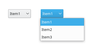
A drop-down list is a GUI control which allows the user to choose one value from a list. When a drop-down list is inactive, it displays a single value. When activated, it displays (drops down) a list of values, from which the user may select one. When the user selects a new value, the control reverts to its inactive state, displaying the selected value. A drop-down list works similar to a list box but hides the complete list until the user initiate the drop down. The disadvantage of drop-down lists compared to related controls like radio buttons or lists is that the options are not visible without further interaction.
The list provides auto-complete feature for the whole string, independently of the “editable” property. Given the items of “bike”, “boat”, and “car”:
If one types “b”, the list selects “bike”.
If one (rapidly) types “bo”, it selects “boat”.
If one types “c”, it selects “car”.
One can repeatedly type a letter to cycle through items of the (read-only) drop-down list starting with this letter.
Guidelines
Is this the right control?
Use a drop-down list for single selection of one out of many items. If users should be able to add items use a combo box.
For only a few options, consider to use a set of radio buttons.
For a single selection out of a large number of items (n>20), use a list view.
Prefer controls that show the options without further user interaction, except for the following cases:
the list of options may change over time,
the contents are obvious from the label and the one selected item, for example Month and January
the control is part of a related sequence of controls. For example, to set a reminder to ring 5 hours or minutes before or after an event.
Behavior
Show a maximum of eight items at once (maxVisibleItems=8).
When possible apply changes immediately but don’t initiate an action (like print, send, delete) when the user selects an item from a drop-down list.
Don’t add controls to the drop-down (e.g. checkboxes for each item).
Place options that represent general options (e.g. all, none) at the beginning of the list.
Sort list items in a logical order. Make sure sorting fits translation.
Make sure the items are easily accessible via keyboard by moving distinctive letters to the beginning of each option. For example, in a list of countries on continents, write “Germany (Europe)” instead of “Europe/Germany”.
Don’t have blank list items; use meta-options, e.g. (None) instead
Appearance
If activating a choice affects the appearance or the enabled state of other controls, place them next to the drop down.
If certain controls in a configuration dialog are only relevant if a certain item is selected (i.e. they are dependent controls), disable them instead of hiding.
Label the drop down with a descriptive caption to the left (cf. alignment).
Create a buddy relation so access keys are assigned.
End each label with a colon.
Use sentence style capitalization for items.