
Slider
Purpose
A slider is a widget with which a user may set a value by moving an indicator, usually in a horizontal fashion. The user may also click on a point on the slider to change the setting. It is different from a scrollbar in that it is typically used to adjust a value without changing the format of the display or the other information on the screen. A slider is used to set defined, contiguous values or a range of discrete values. It is a good choice when values have a relative quantity, not a numeric value. Usually, changes made on the slider are shown immediately. That instant feedback supports input that is not necessarily precise. Compared with spin controls a slider provides faster changes within a larger range but with lower accuracy. Sliders are almost solely operable by mouse.
Guidelines
Is this the right control?
Use a slider when adjusting the value relative to its current value is more important than choosing an absolute value.
Use a slider when it is useful for the user to control the rate of change of the value in real time.
If the value is open-ended on one or both ends, consider using a Spin Box instead.
Behavior
Try to give immediate feedback while the user makes a selection.
Size the control so that a user can easily set the desired value.
Don’t use a non-linear scale, e.g. logarithmic.
Appearance
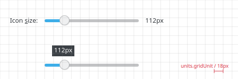
Label the slider with a text label to its left, using sentence capitalization. Provide an access key in the label that allows the user to give focus directly to the slider.
Align the label horizontally in line with the slider.
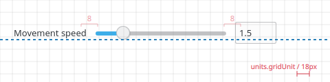
You can show the current value on the right of the slider or if space is very dense show it only as a tooltip when the slider is moved
Show value always or as tooltip
Add the unit to the current value caption, if appropriate.
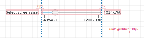
Slider with few steps
eg screen size, symbol-size
Spacing of slider components
Mark significant values along the length of the slider with text or checkmarks. Checkmark have a height of 4 px or 8 if you want to emphasize them.
Min/max labels are optional. Label min/max with real values, eg ‘640x480’ and ‘5120×2880’ in case of screen resolution.
Label the range of values; use checkmark and value label; don’t label every checkmark.
Slider with many steps
eg volume control, mouse speed, brightness
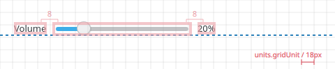
Exact value is not important
Don’t show checkmarks if the exact value is not important
Don’t show min/max label if the values don’t give the user additional information, (eg. don’t label them 0%, 100% when obvious)
If the exact value might be important to the user offer an input field instead of the current value label
Offer text input for exact value
Slider and Spinbox together
Use both a slider and spin box when the value is constrained at both ends, and when there is a large range of values (more than 20 steps) but precise control over the value is needed nevertheless.
Consider using only a slider or a spin box if a well-defined workflow makes the other redundant.
The values of the slider and spin box should be linked so changes to one are immediately reflect in another.
The spin box should be aligned with the long axis of the slider: if the slider is horizontal, the spin box should be to the right of the slider and aligned vertically with the center of the slider; if the slider is vertical, the spin box should be below the slider and aligned horizontally with the center of the slider.
Provide a single label using a text label above it or to the left of the widgets, using sentence capitalization. Provide an access key in the label that should give focus directly to the spin box.
Mark significant values along the length of the slider with text or tick marks.