
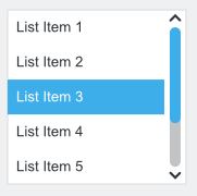
List View
Purpose
A list view offers orientation, organization, and allows navigation without the need for more controls. Additionally, a list view may be used for single selection (users select one item from a list of mutually exclusive values) or multiple selections (selections in combination with the Shift key or Control key). However, because there is no common visual clue whether a list box’ mode is single or multiple and since other controls are more efficient for single selection, a list box should be used for single selection only.
Guidelines
Is this the right control?
Prefer a list view to show items that belong together and in case there is enough space.
Use the list view for selection when it is easy for users to know which items are selected at any given time, for one or more of these reasons:
There are no more than twice the number of options then are visible at a time
The options are well-known and familiar (for example months of a year or days of a week)
Usually the selected options are close to each other in the list
Behavior
Don’t have blank list items; use meta-options, e.g. (None) instead.
Place options that represent general options (e.g. All, None) at the beginning of the list.
Sort list items in a logical order. Make sure sorting fits translation.
Attention
 For accessibility, make sure to test
keyboard navigation with the list.
For accessibility, make sure to test
keyboard navigation with the list.
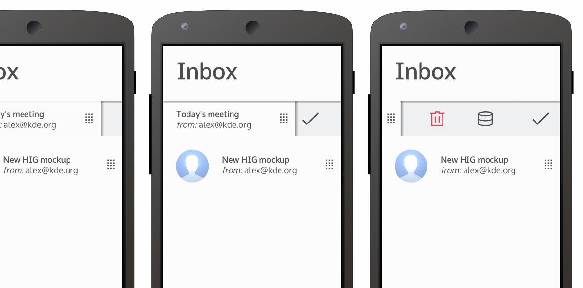
On-Demand Actions
List items can uses an on-demand pattern as an alternative to always-visible controls. If the user often performs tasks on single items of a list, you can add on-demand controls to the list item for these.
 Desktop
If only one action is available, most the time it is better to not use the on-demand pattern and instead show the action right away.
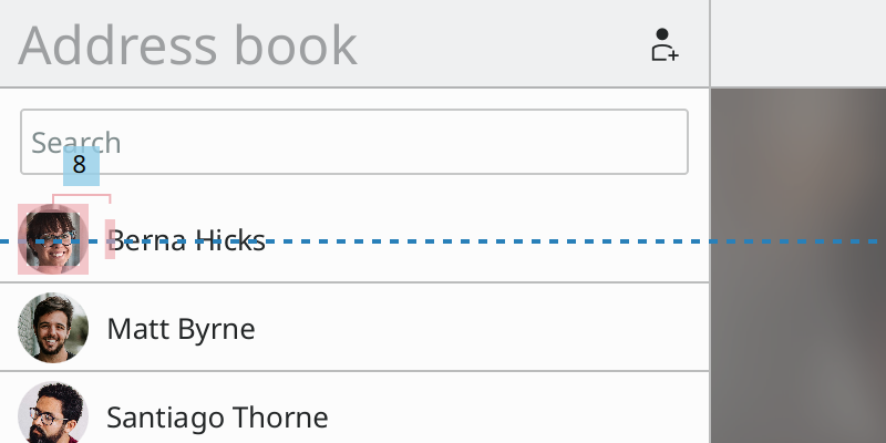
On-demand controls are shown when hovering over the item with the cursor. A handle is shown to support devices with touch screens. Swiping the handle right to left reveals the actions. As soon as the user taps anywhere else or the pointer is no longer hovering over the item, the handle is slid back.
 Mobile
On-demand controls are revealed by sliding a handle from right to left to reveal them. As soon as the user taps anywhere else, the handle is slid back.
Selection
List items can contain a checkbox to enable the selection of multiple items at the same time. Clicking on the checkbox should not trigger an action, but only change the selection. Place buttons below the list to perform actions on the selected items.
If the selection is the only action a user can execute on the items, there is no need for a checkbox. Change the background item color to toggle selection state.
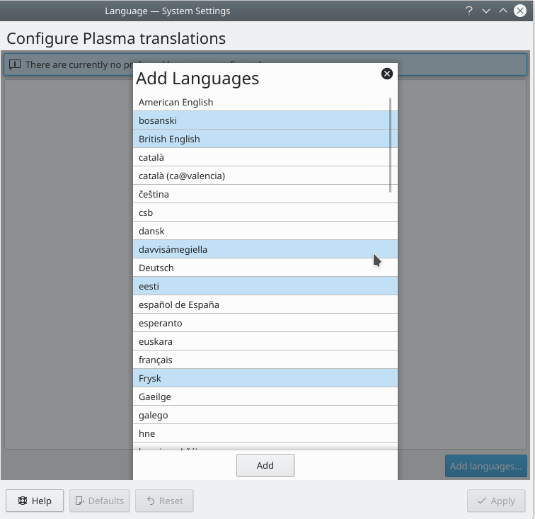
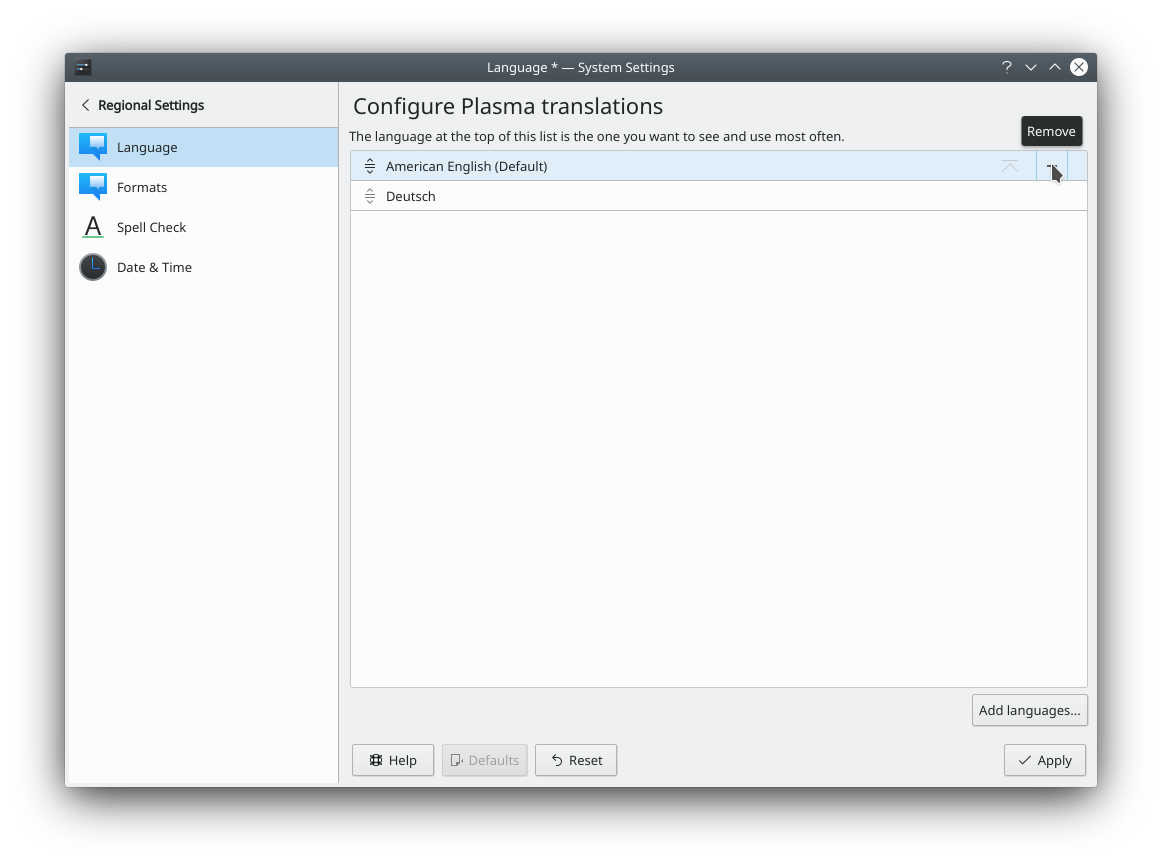
Multiple selected items in a picker overlay.
Don’t provide extended multiple selections with Shift+Click or Ctrl+Click to select groups of contiguous or non-adjacent values, respectively. Instead, use the dual-list pattern or the picker pattern if multiple items have to be selected, because it allows users to easily see which items are selected at any point, without having to scroll through the available options, and it can be used with only the mouse.
Picker
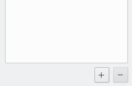
Lists can be used for the picker pattern. Place a button below the list to add items to the list. To remove items from the list, either add an remove action on the item, or give the user the possibility to select items and add a global remove button at the bottom of the list.
Ordering
Allow drag and drop of items, if the the order of the items can be changed by the user.
Desktop
If you use a dual-list pattern and want to be able to re-order the items in the selected list you can add aditional up and down buttons.
Dual-list pattern with up and down buttons
Appearance
Show at least four list view items at any time without the need for scrolling.
Make windows and the list within a dialog or utility window resizeable so that users can choose how many list items are visible at a time without scrolling. Make these windows remember last used dimensions.
If selections affect the appearance or control states, place these controls next to the list view.
Disable controls in a dialog if not in use rather than hide, or remove them from the list (i.e. they are dependent controls),
Label the list view with a descriptive caption to the top left (cf. alignment).
Create a buddy relation so access keys are assigned.
End each label with a colon. “:”
Use sentence style capitalization for list view items.
You can use alternate row colors (use theme settings).
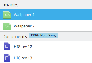
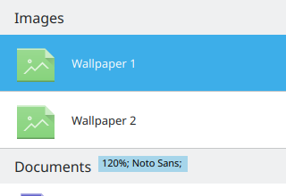
For section headers use 120% font size and the alternate background color. Don’t place a border below the section header.
Desktop
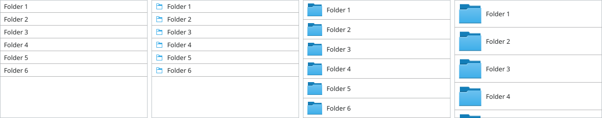
List items with and without icons
List items can have a lot of different styles and sizes, but should always be coherent in a list.
Default padding of a SwipeListItem on desktop
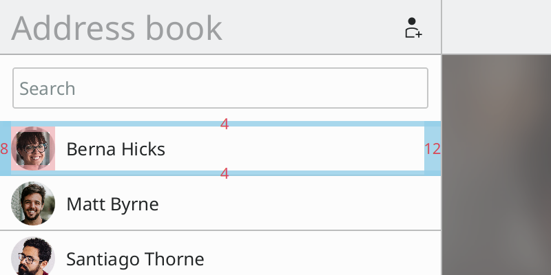
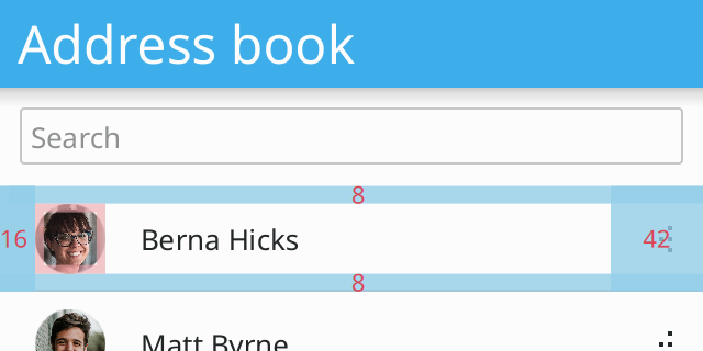
Items have a padding of Units.smallSpacing on the top and bottom and a padding of 2 * Units.smallSpacing on the left.
Label is vertically centered
Labels are vertically centered within the list item. If the list item includes an icon, add a 2 * Units.smallSpacing margin between the icon and the label.
Mobile
Default padding of a SwipeListItem on mobile
Items have a padding of Units.largeSpacing on the top and bottom and a padding of 2 * Units.largeSpacing on the left.
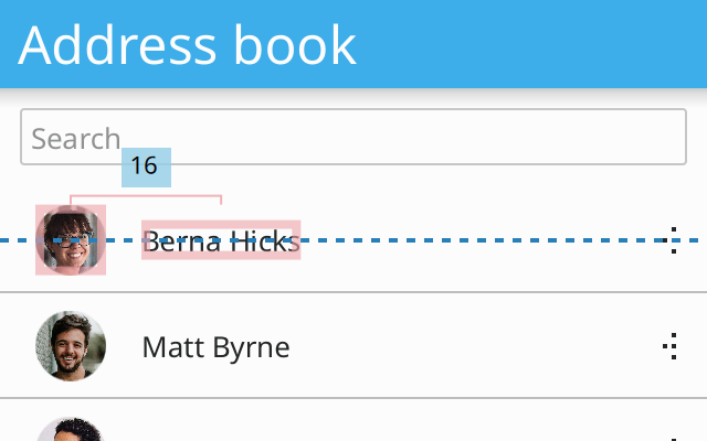
Label is vertically centered
Labels are vertically centered within the list item. If the list item includes an icon, add a 2 * Units.largeSpacing margin between the icon and the label.
Selection
Checkboxes should be placed to the left of the item.
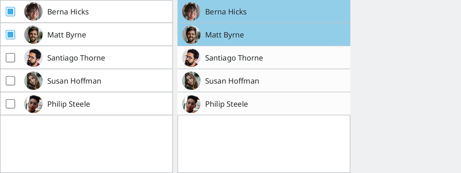
List items with checkboxes for multi selection.
Add a 2 * Units.largeSpacing margin between the checkbox and the icon or the label.
If you change the background color to toggle selection state, use Kirigami.Theme.highlightColor to indicate an active item.
Code
Kirigami
...
ListView {
    ...

    delegate: Kirigami.SwipeListItem {
        id: lineItem

        contentItem: Row {
            spacing: lineItem.leftPadding

            Item {
                width: Kirigami.Units.iconSizes.medium
                height: width

                Image {
                    id: avatar
                    width: parent.width
                    height: width
                    source: "..."
                    visible: false
                }
                OpacityMask {
                    anchors.fill: avatar
                    source: avatar
                    maskSource: Rectangle {
                        height: avatar.width
                        width: height
                        radius: height / 2
                    }
                }
            }
            Label {
                anchors.verticalCenter: parent.verticalCenter
                text: "..."
            }
        }
        actions: [
            Kirigami.Action {
                text: i18n("&Make call")
                iconName: "call-start"
            },
            Kirigami.Action {
                text: i18n("&Write mail")
                iconName: "mail-message"
            }
        ]
    }

    ...
}
...