
Picker
Pickers implement a pattern to select multiple items from a list of available choices. The main component only displays the selected items, and more items can be added by choosing them from a list or grid in a dialog or overlay.
In compairison to dual lists, they work well on desktop and mobile.
When to Use
Use a picker for multiple selection and in case of large lists.
Don’t use it if both selected and unselected items need to be visible at once. Use a dual list instead.
Don’t use a picker to show data primarily.
If selection state needs to change often, think about using a list with checkboxes or similar instead.
How to Use
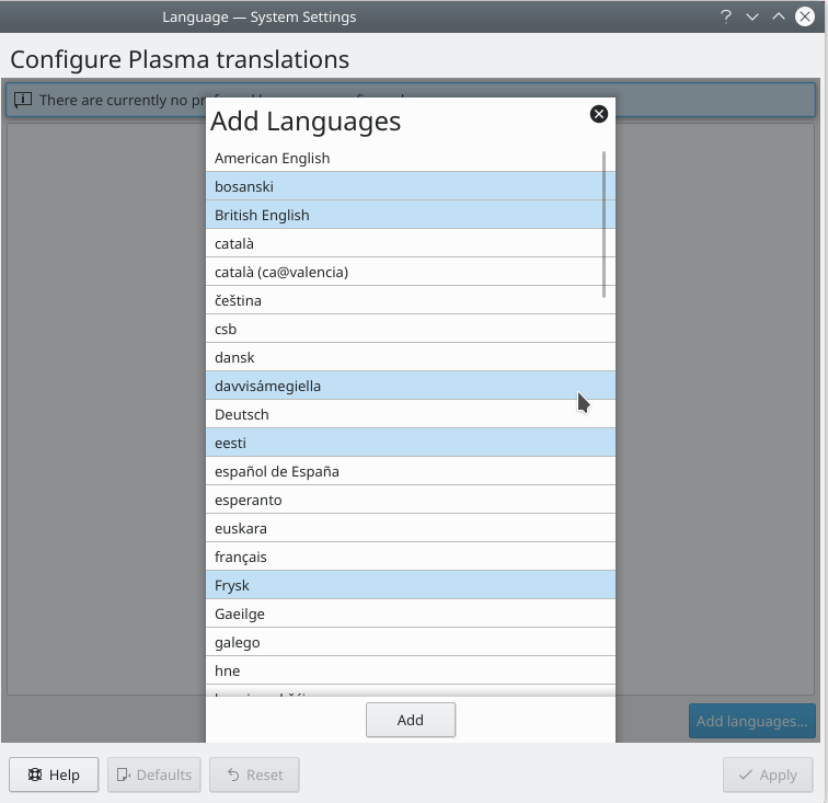
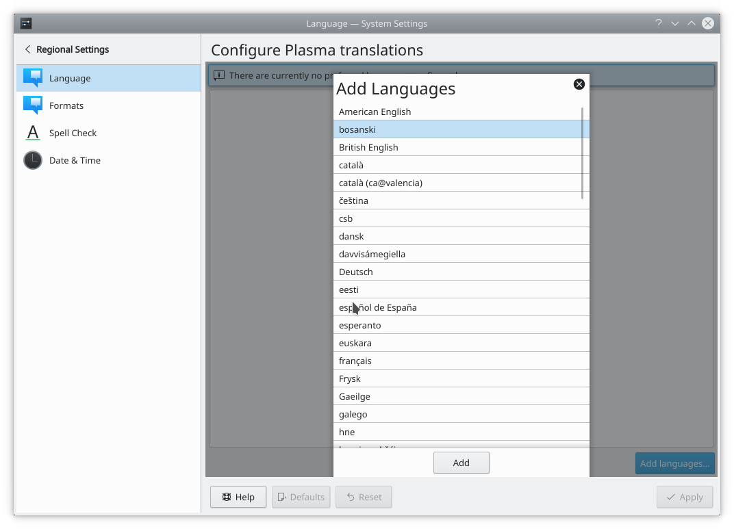
Using an overlay to pick aditional items.
Open a list of additional items to choose in an overlay sheet or a dialog.
Allow the user to select multiple items at once.
Use either an on-demand control or display a button to allow the user to deselect items.
If the list of selected items can be reordered, place up/down buttons to the right of the list of current items. Only enable the up/down buttons when an item is selected and can be moved.
Don’t have blank list items; use meta-options (e.g. “None”) instead.
Place options that represent general options (e.g. “All”, “None”) at the beginning of the list.
Sort list items in a logical order. Alphabetical sorting should be able to change when the text is translated.
If the lists or grids appear in a dialog, consider making the window and the lists or grids within it resizeable so that the user can choose how many list items are visible at a time without scrolling.
Use sentence style capitalization for items.